Quick charts
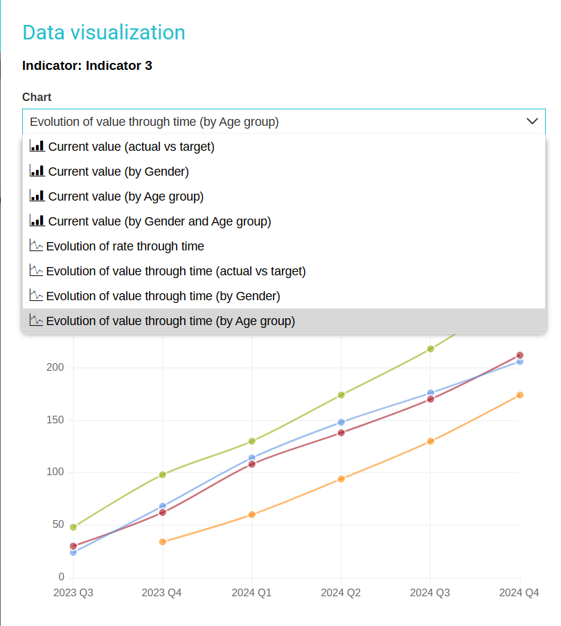
Within the logframe module, whether you're navigating through the Logframe design tab or working within the Data entry section, you will find convenient access to a variety of pre-made charts. These charts serve as tools for visualizing indicator data, providing you with insightful and easily understandable representations of the information at hand.

The quick charts will provide a series of bar charts and line charts, with various options for comparing against targets and viewing selected disaggregation dimensions.
Bar charts visually represent data using bars of different lengths, while line charts display information through data points connected by lines, enabling easy comparison of data sets and trend identification over time. These charts offer flexibility in comparing data against predefined targets, assessing performance and progress, and providing a detailed view based on user preferences and requirements. This enhances data analysis capabilities and empowers informed decision-making.
Note: If you just updated the indicator actuals you might have to wait a couple minutes to see the results show in the charts.

If you wish to make changes to the visuals, you have the option to click on Edit , located within the interface. This action will seamlessly redirect you to the Analytics module, where you can proceed with modifying the visuals to better suit your preferences and requirements. Whether it's adjusting the layout, color scheme, or any other visual elements, this feature provides you with the flexibility to tailor the visuals to your exact specifications.

Moreover, in addition to the options mentioned, you also have the capability to click on Export in order to obtain a downloadable image of the visual. This feature can be particularly useful when you need to share the visual with individuals who may not have immediate access to the platform where it is originally located.
