Configure form fields
To configure a field, click the pen icon next to the field's name. This will allow you to:
- Specify if the field is mandatory.
- Specify if the field is confidential.
- Specify if the field must be used as a unique component.
- If it is a list, specify the items in the list, or if the user can select multiple items.
- If it is a text, specify the maximum length.
- Etc.

|
Options available for most field types
|
- Description: Text that will appear below the label of the field.
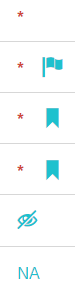
- Mandatory: Fields need to be filled to save a record, represented by a red star icon.
- Confidential: Content of confidential fields can only be viewed by authorized users. When sharing a form with other users, you can specify if they will can see confidential fields, represented by an eye icon.
- Display field: Allows to use the field for record identification. If another form has a List field that lists the records in this form, the dropdown list will show the (1 or many) display fields to identify records, represented by a flag icon.
- Not applicable permitted: Allows users to have an option (checkbox) to leave the field unanswered, represented by "NA".
- Use field as unique component: Check this option to consider this field for the creation of a unique record. For instance, if a survey is done twice (pre and post), the survey form could have the date and respondant fields as a unique component. This will validate that there are never 2 records for the same date and same respondant.Represented by a bookmark icon.
- Conditional: (Skip pattern) Allows to display this field only if previous fields respect the specified conditions.
|
| Options available for Text fields |
- Multiple lines: Specify if the text box should be 1 line or multiple lines (paragraph).
- Limit of characters: Allows to specify a maximum number of characters.
- Force uppercase: All text entered in this field will be capitalized.
- Allow only numeric input: When enabled, only numbers are allowed, including negative values and decimals.
|
| Options available for Lists fields |
- Allow multiple selection: Allows to enable the selection of many items in the list.
|
| Options available for System and projects lists |
- List: Allows to select which list the dropdown list will pull its options from.
|
| Options available for Custom forms |
- Custom form: Allows to select which custom form the dropdown list will pull its options from.
|
| Options available for Custom options |
- Custom options: Allows to edit the options of the list. (Enter the option in the "new value" field, and click "Add option")
|
| Options available for Date fields |
- Future dates only: Prevents users from entering dates in the past.
|
| Options available for Number fields |
- Minimum value: Prevents users from entering a number that is below the minimum value.
- Maximum value: Prevents users from entering a number that is above the maximum value.
|
| Options available for Yes/No fields |
- Labels: Allows to choose between displaying Yes-No or True-False.
|
| Options available for Location fields |
- Allow multiple selection: Allows to enable the selection of many locations.
- Filters: Allows to filter down the list of available locations to choose from.
|
Some of these configurations cannot be modified once the form contains data. Once there is data in a form, you CANNOT:
- Make a field mandatory
- Delete a field
- Specify maximum/minimum value
- Change the type of field
- Make a field display field
- Make a field unique component
- Edit the conditions
- Edit the confidentiality
Once the form contains data, you CAN always:
- Add additional fields
- Rename a field
- Add a description to a field
- Add an image to a field
- Edit the code of the field
- Enable allow multiple selection

